
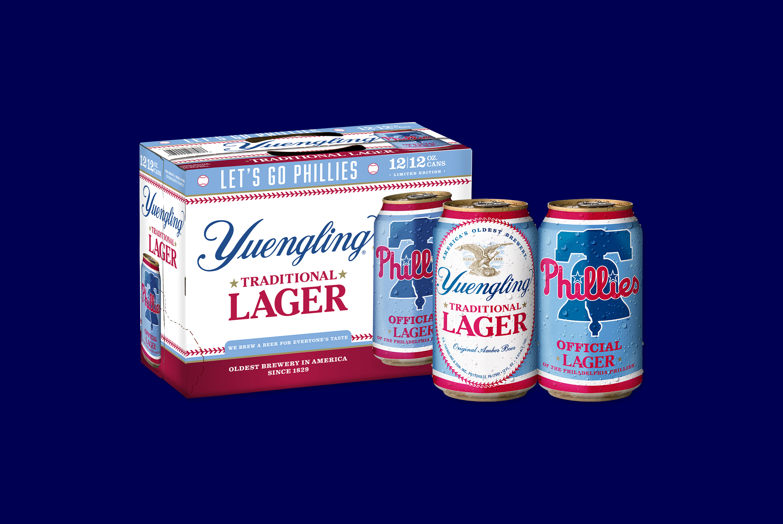
Yuengling Lager × Philadelphia Phillies
Two Pennsylvania icons. One limited-edition packaging system, designed to celebrate the partnership and built to hold up across four formats.
Objective: When Yuengling and the Philadelphia Phillies partnered on a limited-edition Lager release, the design challenge was balancing two sets of highly governed brand standards simultaneously: Yuengling’s heritage brewing identity and the Phillies’ MLB-licensed visual system. Working closely with the creative and marketing teams at both Yuengling and the Phillies, I led the development of a packaging system that honored both brands while giving the collaboration its own distinct visual moment.
Solution: Every decision required the two brands to feel like equal partners on the same canvas, neither overshadowing the other. As Art Director, I directed the creative process across four formats while mentoring a summer design intern through concept to final production files. The Powder Blue colorway anchored the system across the 12oz and 16oz can labels and both 12-pack formats, giving the limited-edition release a throwback identity immediately recognizable to Phillies fans and distinct on shelf from Yuengling’s standard Lager packaging.
Product photography by Michael Choate.
Project Type & Role
In-House Project
Art Director
Graphic Designer
Client
D.G. Yuengling & Son, Inc.
Deliverables
12oz Can Label
12/12 Pack Can
16oz Can Label
12/16 Pack Can
Year
2026