
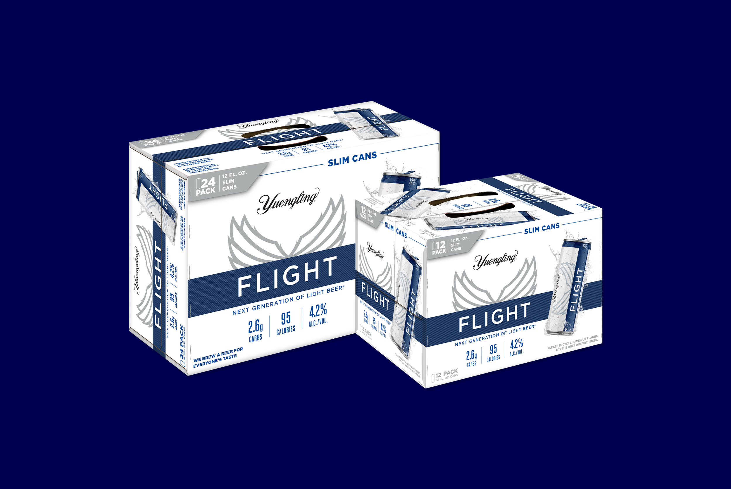
Yuengling Flight Slim Cans
Adapting a bottle-first brand identity across three new packaging formats, without losing what makes Flight recognizable on shelf.
Objective: When Yuengling expanded Flight from bottles to slim cans, the work wasn’t starting over; it was more complex than that. A bottle-first identity needed to translate into three new formats (12oz single, 12-pack, 24-pack) without losing brand clarity or shelf presence. Working closely with Yuengling’s Marketing Director, Brand Manager, and Art Director, I researched how competitors handled the format shift, what broke at slim-can proportions, and where brands lost recognition by playing it too safe.
Solution: Every decision came back to the same question: what does this need to do at shelf distance, and what does it need to do in someone’s hand? I anchored the system around Flight’s signature wings and navy band design, creating consistency across all formats and scaling to work at every size. The result is a packaging system that reads as a family on the shelf and holds its own individually, from a single 12oz slim can to a 24-pack, while keeping the brand’s clean, refreshing identity intact across every surface.
Product photography by Michael Choate.
Project Type & Role
In-House Project
Graphic Designer
Client
D.G. Yuengling & Son, Inc.
Deliverables
12oz Can Label
12/12 Pack Can
24/12 Pack Can
Year
2023